
In 2026, print and pattern design sits at an interesting crossroads. Technology has never been more advanced, giving designers the ability to create detail, scale and complexity that simply was not possible before. At the same time, there is a clear pull back towards the human hand. Texture, imperfection and emotion matter again.
Designers are increasingly drawn to work that feels real. Marks that are not perfectly aligned, lines that wobble slightly, surfaces that feel considered rather than automated. These qualities bring warmth and personality, offering a balance to the precision of digital tools and AI.
Print is no longer just about decoration. It has become a way of telling stories. Patterns now carry emotion, memory and a sense of place. In a fast, highly digital world, these designs offer escapism and imagination. They invite people to slow down, look closer and connect with what they see.
Key directions in print & pattern design
Art meets technology
 Digital printing continues to open up new creative possibilities. Layering, photographic elements and digitally manipulated effects allow prints to feel rich and immersive. Many designs now sit somewhere between image and texture, with surfaces that appear tactile even before they are touched.
Embracing imperfection
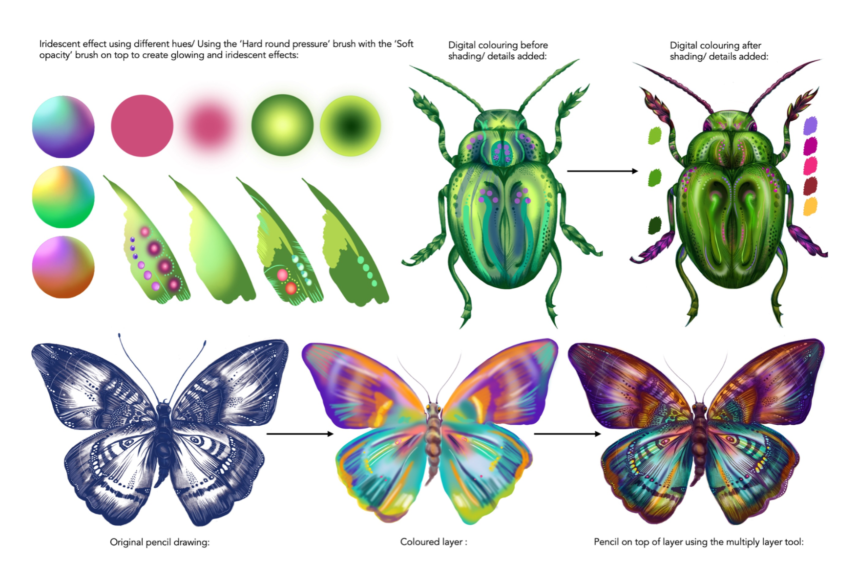
 As AI becomes more common in design, imperfection becomes more valuable. Hand drawn marks, uneven lines and organic shapes bring a sense of individuality and intuition. These details are no longer flaws. They are what make a design feel human and distinctive.
Floral botanicals
 Florals remain a key theme, but they are becoming bolder and more expressive. Oversized blooms, painterly strokes and highly detailed surfaces add drama and depth. Simple backgrounds allow the florals to take centre stage, while textured finishes add another sensory layer.
Mythical animals

Animal prints are moving away from literal interpretations. Leopard, snake and hybrid skins are reworked through colour, scale and abstraction. The result is something more imaginative and dreamlike. These designs hint at mythical creatures and imagined landscapes, sitting somewhere between reality and fantasy.
Pattern clash & layered surfaces

Maximalism is evolving into something more intentional. Designers are playing with scale, contrast and layering in a way that feels considered rather than chaotic. Unexpected combinations create energy and interest, moving away from predictable matching towards surfaces that feel bold and confident.
Storytelling motifs
Print is increasingly used to tell stories. Motifs carry symbolism, emotion and personal meaning. Whether used in interiors, fashion or products, these designs create immersive experiences that feel expressive and emotionally engaging.
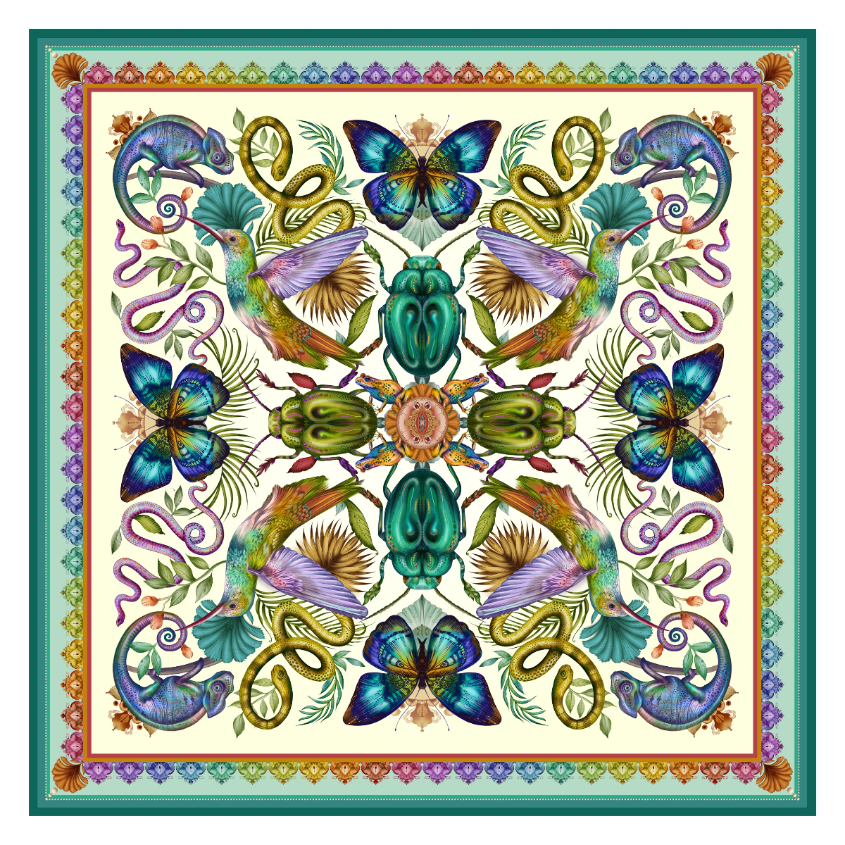
Spotlight: Beth Lingard

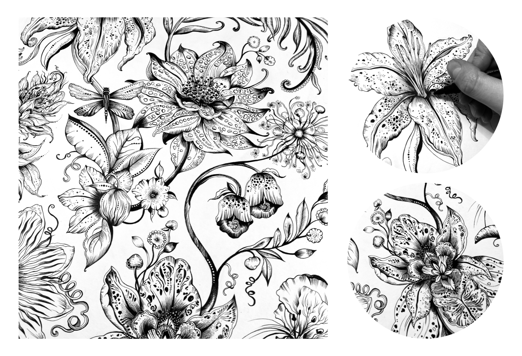
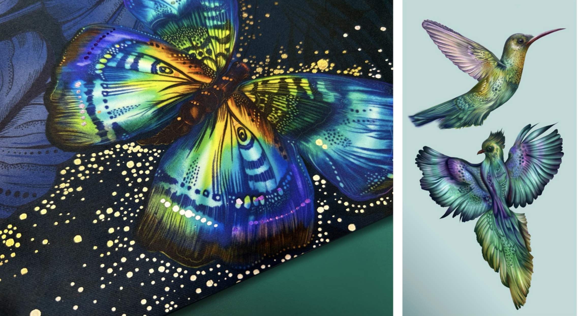
Beth Lingard’s work captures the spirit of our print and pattern design direction in 2026. Her designs explore surreal natural forms, imagined creatures and richly layered textures. Animal and botanical references are transformed into dreamlike scenes that feel both detailed and otherworldly.
Working with fineliner and pencil, Beth builds intricate drawings filled with marks and textures inspired by imagined landscapes. These are then digitally painted in deep jewel tones, with bursts of colour that bring the work to life. The result is prints that feel immersive and expressive, offering a sense of escape and imagination while retaining a strong human presence.
Summary
In 2026, print and pattern design is about more than surface decoration. It is where technology, craft and creativity meet. Imperfection is embraced, layering is used with intention and colour is chosen to bring balance rather than overwhelm. Patterns invite emotion and curiosity, turning fabrics, walls and objects into spaces that feel thoughtful, expressive and alive.
Colour direction in print & pattern design 2026
Teal and blue-green tones emerge as quiet constants rather than bold statements. Sitting between nature inspired greens and technology driven blues, these colours feel balanced and grounding. From soft mineral aquas to deeper petrol and algae shades, blue-greens offer calm, versatility and longevity.
Colour pairing
Blue-greens work as unifying tones across a palette. They pair easily with warm pinks and muted corals to soften a scheme, while deeper plum tones add contrast and richness. Subtle metallics such as brushed brass or soft gold introduce refinement without overpowering the overall look.
Print and pattern application
In print and pattern design, blue-greens tend to work best as base tones rather than dominant colours. Their subtlety allows layered designs, repeating motifs and tonal variation to feel cohesive and timeless within evolving colour palettes.
Summary
In 2026, print and pattern design moves beyond decoration. It becomes a way to express emotion, tell stories and explore imagination. Technology and craft work together, imperfection adds character, and colour is used to unify rather than dominate. The result is design that feels considered, human and lasting.