
Elen Hughes of Premier Digital Textiles explores how pattern clash is evolving from visual excess into a more disciplined design language, and why layered surfaces now depend as much on editing and technical control as they do on creative ambition.
Pattern clash is often mistaken for excess. In reality, the most compelling layered surfaces in 2026 are not defined by visual noise, but by control. What once felt rebellious or deliberately chaotic has matured into something more considered. Designers are still embracing complexity, but they are using it with far greater intention.
At Premier Digital Textiles, we see this shift clearly in the work coming through production. Multiple motifs, contrasting scales and varied textures are being brought together within a single composition, but rarely without a clear internal structure. The strongest examples do not rely on novelty or overload. They rely on rhythm, editing and balance.
That distinction matters. Successful pattern clash is not simply about adding more. It is about knowing what should dominate, what should recede and what should connect the surface as a whole. A layered design still needs a point of rest for the eye. It still needs hierarchy. Without that, complexity quickly slips into confusion.
This is one of the clearest signs of maturity in contemporary print and pattern design. Designers are no longer layering surfaces simply to create impact. They are building richer visual experiences through composition. Repetition may be offset by tonal restraint. Contrasting motifs may be united by shared colour anchors. Dense areas may be balanced by quieter passages that allow the surface to breathe. In the best work, pattern clash feels composed rather than accumulated.
From a production perspective, that level of control is demanding. Layered surfaces are among the most technically revealing categories in digital print. When patterns interact, even minor inconsistencies become highly visible. Misalignment between repeats, uneven ink behaviour or small shifts in colour balance can disrupt the intended structure of the design.
The more intricate the composition, the less margin there is for error. Fine line work may sit against broad tonal grounds. Foreground motifs may depend on clear separation from more subtle textures beneath them. If edges soften or colour drifts, motifs begin to merge, depth is reduced and the surface can lose both clarity and tension. What should feel dynamic and deliberate can instead appear congested.
This is where fabric preparation becomes critical. Digitally prepared fabrics such as PrepRITE provide the stability required to support layered designs at this level. Controlled absorbency and predictable surface behaviour help maintain motif separation, tonal consistency and repeat accuracy, allowing each element to retain its role within the wider composition.
That reliability matters because pattern clash often depends on hidden structure. What appears instinctive on the surface is usually held together by quiet discipline underneath. Colour anchors may recur across disparate motifs. Tonal relationships may create continuity between different scales. Repeats may sit invisibly beneath dense layering. If the printed fabric does not behave consistently, that structure quickly begins to unravel.
At Premier Digital Textiles, we see the most successful examples of pattern clash as a balance between ambition and editing. Designers understand when to push the surface and when to hold back. They are not layering pattern for effect alone. They are using it to create movement, contrast and depth with purpose.
This reflects a broader evolution in how complexity is approached across print and pattern design. As digital production capabilities have expanded, the conversation has shifted. The question is no longer whether a surface can carry multiple elements. It is whether those elements have been composed with enough clarity to hold together.
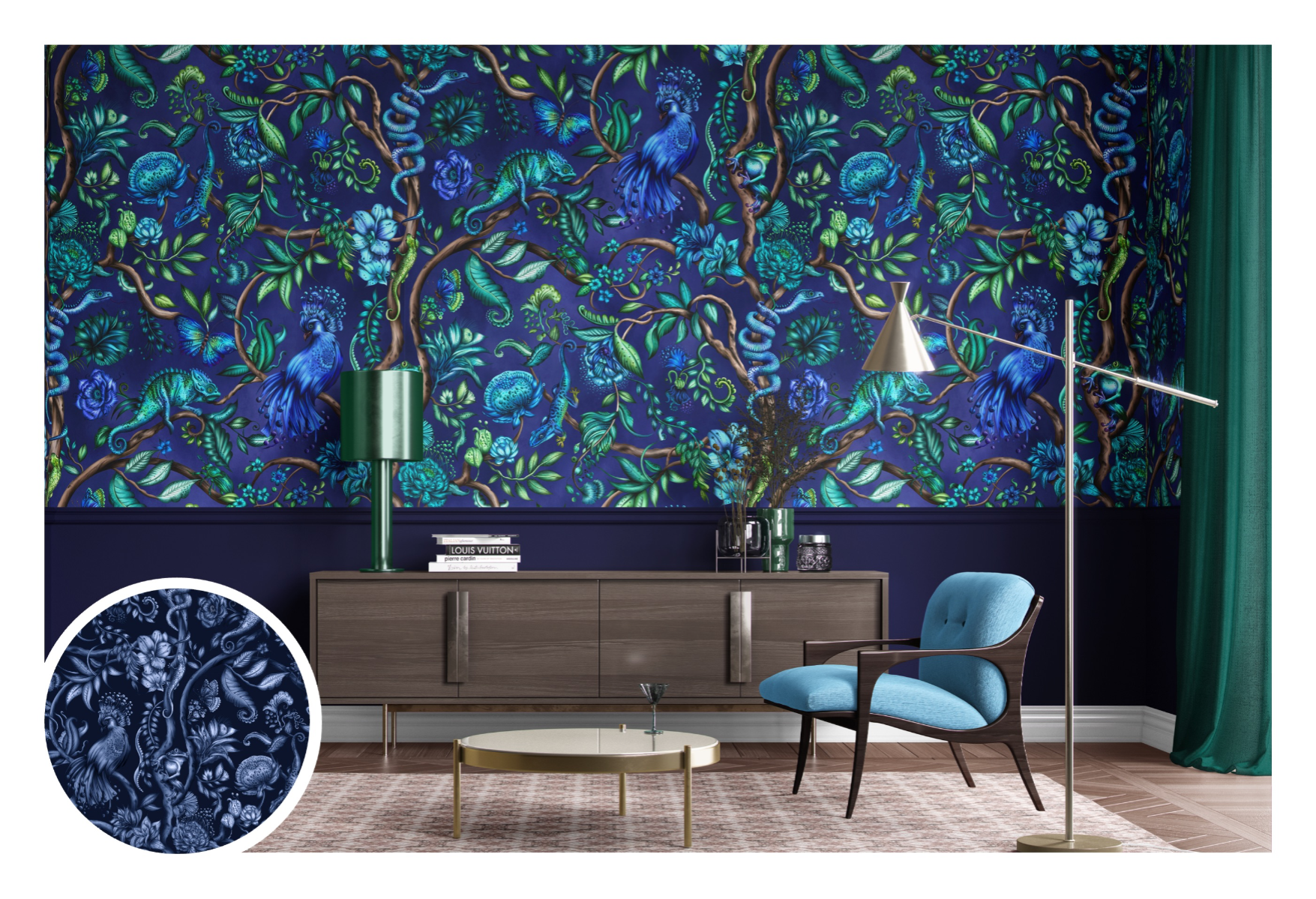
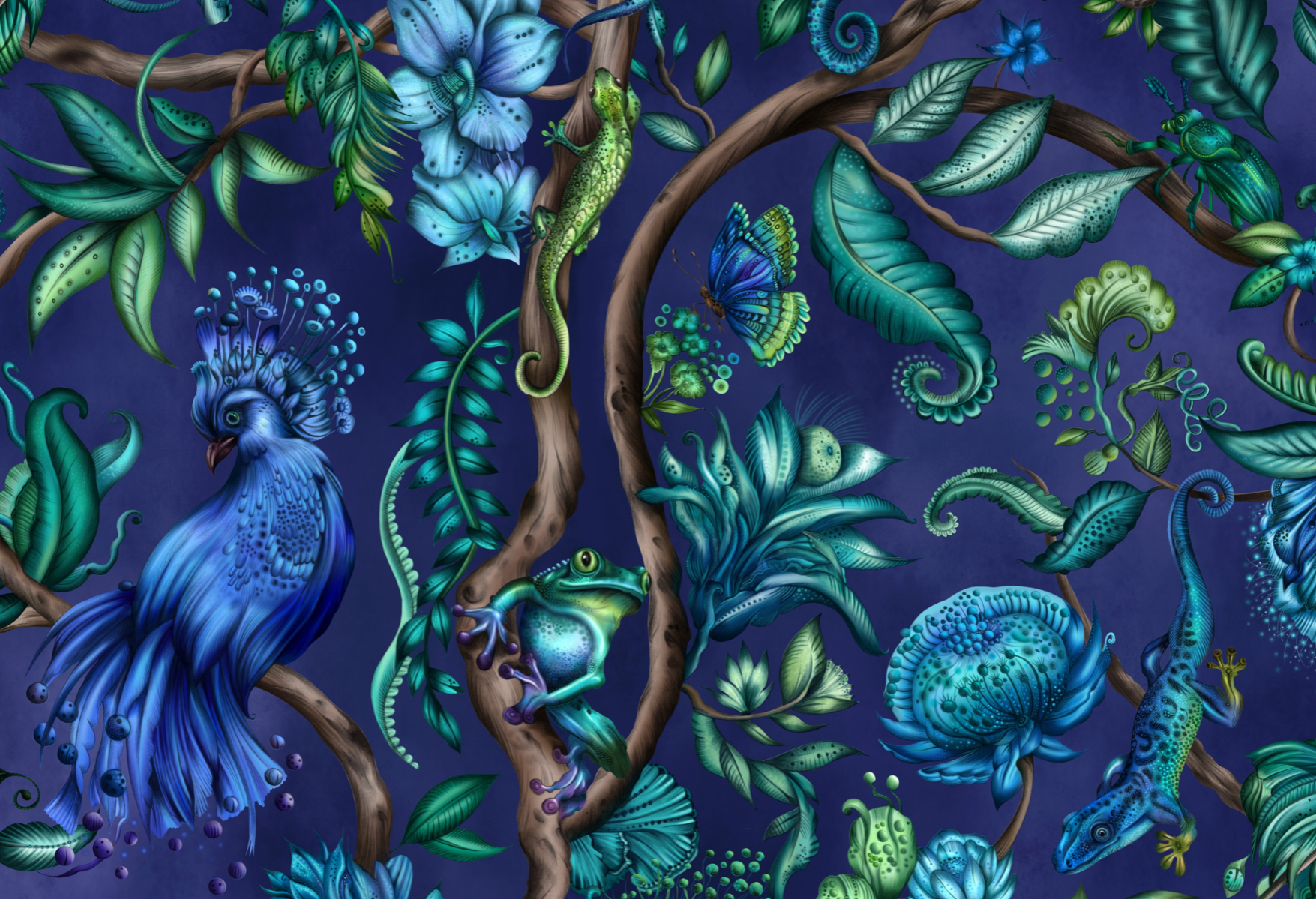
Beth Lingard’s work offers a clear example of this more disciplined approach to pattern clash. With her intricate layering and sensitive use of colour, Lingard combines densely detailed motifs with moments of visual pause, allowing each element to retain clarity within the composition. Her surfaces often appear richly complex at first glance, yet reveal an underlying structure built on repetition, tonal harmony and careful spacing. Rather than overwhelming the viewer, her designs demonstrate how pattern clash can feel both expressive and controlled, reinforcing the idea that successful layering depends as much on editing as it does on creative ambition.
In 2026, the strongest pattern clash is not about more pattern. It is about more control. When creative confidence is matched by technical precision, layered surfaces can feel expressive, sophisticated and enduring rather than simply busy. That is what turns maximalism from a statement into a skill.